Meisterline
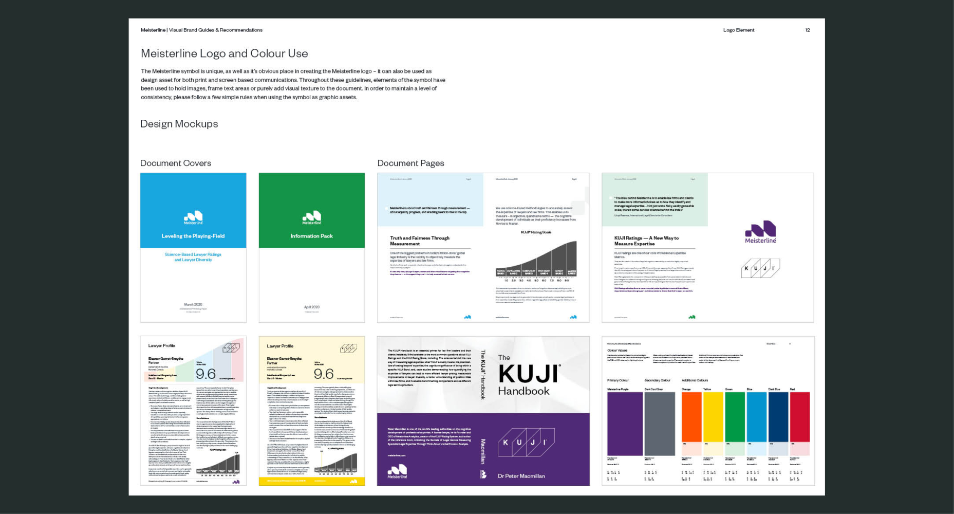
For Meisterline, I joined the project at a later stage to refine and evolve the existing visual identity for a legal analytics company based in Melbourne, Australia. Working within the established brand direction, my role focused on strengthening clarity, consistency, and usability across the system while ensuring the brand felt confident and approachable rather than cold or overly corporate.
I updated and extended key brand elements including colour, typography, and layout rules, refining how the identity was applied across both digital and print materials. The emphasis was on balancing trust and rigour with a more human tone, ensuring complex, data-driven content could be communicated clearly without losing credibility.
The result was a more cohesive and flexible brand system that improved consistency across touchpoints and supported ongoing use, helping Meisterline stand out in a traditionally conservative sector while remaining professional and authoritative.